AndroidExpandingViewLibrary alternatives and similar packages
Based on the "Other Widget" category.
Alternatively, view AndroidExpandingViewLibrary alternatives based on common mentions on social networks and blogs.
-
-
AndroidSlidingUpPanel
This library provides a simple way to add a draggable sliding up panel (popularized by Google Music and Google Maps) to your Android application. Brought to you by Umano. -
BottomBar
(Deprecated) A custom view component that mimics the new Material Design Bottom Navigation pattern. -
ShortcutBadger
An Android library supports badge notification like iOS in Samsung, LG, Sony and HTC launchers. -
-
SystemBarTint
[DEPRECATED] Apply background tinting to the Android system UI when using KitKat translucent modes -
TapTargetView
An implementation of tap targets from the Material Design guidelines for feature discovery. -
android-viewbadger
[DEPRECATED] A simple way to "badge" any given Android view at runtime without having to cater for it in layout -
android-stackblur
Android StackBlur is a library that can perform a blurry effect on a Bitmap based on a gradient or radius, and return the result. The library is based on the code of Mario Klingemann. -
android-iconify
Android integration of multiple icon providers such as FontAwesome, Entypo, Typicons,... -
DraggablePanel
DISCONTINUED. Android library used to create an awesome Android UI based on a draggable element similar to the last YouTube graphic component. -
aFileChooser
DISCONTINUED. [DEPRECATED] Android library that provides a file explorer to let users select files on external storage. -
Swipecards
A Tinder-like Android library to create the swipe cards effect. You can swipe left or right to like or dislike the content. -
TourGuide
TourGuide is an Android library that aims to provide an easy way to add pointers with animations over a desired Android View -
-
-
-
StickyGridHeaders
DISCONTINUED. An Android Library that makes it easy to make grid views with sectioned data and headers that stick to the top. -
FloatingView
FloatingView can make the target view floating above the anchor view with cool animation -
-
TileView
TileView is a subclass of android.view.ViewGroup that asynchronously displays, pans and zooms tile-based images. Plugins are available for features like markers, hotspots, and path drawing. -
Bubbles for Android
Bubbles for Android is an Android library to provide chat heads capabilities on your apps. With a fast way to integrate with your development. -
RippleView
View that imitates Ripple Effect on click which was introduced in Android L (for Android 2.3+) -
Android-ActionItemBadge
This library offers a simple method to add a small badge icon to your ActionBar-MenuItem -
android-sliding-layer-lib
DISCONTINUED. Highly customizable SlidingLayer as you have seen in Wunderlist -
SortableTableView
An Android library containing a simple TableView and an advanced SortableTableView providing a lot of customisation possibilities to fit all needs. -
ScratchView
ScratchView repo is UX Design involving scratch cards like views which are scratched to reveal the information they conceal. -
FabricView
A new canvas drawing library for Android. Aims to be the Fabric.js for Android. Supports text, images, and hand/stylus drawing input. The library has a website and API docs, check it out


InfluxDB - Power Real-Time Data Analytics at Scale


* Code Quality Rankings and insights are calculated and provided by Lumnify.
They vary from L1 to L5 with "L5" being the highest.
Do you think we are missing an alternative of AndroidExpandingViewLibrary or a related project?


README
About the Library
inspiration
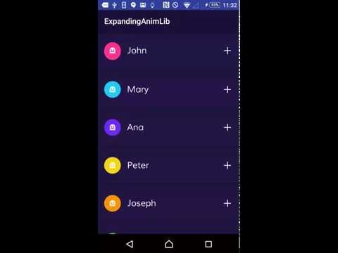
This library is strongly inspired in this concept from Hila Peleg in dribble. See it below
Working example
For more details on how to use this library please refer to the example in this repository. You can see a video of the example working here:
Adding the Library to gradle file
dependencies {
    compile 'com.diegodobelo.expandingview:expanding-view:0.9.4'
}
Using the Library
Layouts
First of all include the ExpandingList in your Activity (or Fragment) layout. This will be the list of items (ExpandItem):
<com.diegodobelo.expandingview.ExpandingList
        android:id="@+id/expanding_list_main"
        android:layout_width="match_parent"
        android:layout_height="match_parent"/>
Now create a new layout (xml) file to represent the item (such as res/layout/expanding_item.xml). This will be the Item (header) that can be expanded to show sub items:
<RelativeLayout xmlns:android="http://schemas.android.com/apk/res/android"
    xmlns:app="http://schemas.android.com/apk/res-auto"
    android:layout_width="match_parent"
    android:layout_height="94dp">
    <TextView
        android:id="@+id/title"
        android:layout_width="wrap_content"
        android:layout_height="wrap_content"
        android:layout_centerVertical="true"
        android:gravity="center_vertical|left"
        android:textSize="22sp"/>
</RelativeLayout>
Create another layout file to represent the sub items (such as /res/expanding_sub_item.xml). This will be the sub items that will be shown when the Item is expanded:
<RelativeLayout xmlns:android="http://schemas.android.com/apk/res/android"
    xmlns:app="http://schemas.android.com/apk/res-auto"
    android:layout_width="match_parent"
    android:layout_height="48dp">
    <TextView
        android:id="@+id/sub_title"
        android:layout_width="match_parent"
        android:layout_height="match_parent"
        android:layout_centerVertical="true"
        android:layout_marginLeft="8dp"
        android:textSize="18sp"
        android:gravity="center_vertical|left"/>
</RelativeLayout>
Now create a layout file (such as /res/expanding_layout.xml) to represent the whole item, including both item layout and sub item layout. We will explain each custom attribute later:
<com.diegodobelo.expandingview.ExpandingItem
    xmlns:android="http://schemas.android.com/apk/res/android"
    xmlns:app="http://schemas.android.com/apk/res-auto"
    android:layout_width="match_parent"
    android:layout_height="wrap_content"
    app:item_layout="@layout/expanding_item"
    app:sub_item_layout="@layout/expanding_sub_item"
    app:indicator_size="42dp"
    app:indicator_margin_left="16dp"
    app:indicator_margin_right="16dp"
    app:show_indicator="true"
    app:show_animation="true"
    app:start_collapsed="true"
    app:animation_duration="250"/>
Note that we included expanding_item and expanding_sub_item layouts created before.
Java code
Now that you have all the required layouts you are able to use them in Java code. Let's start inflating the ExpandingList:
ExpandingList expandingList = (ExpandingList) findViewById(R.id.expanding_list_main);
Create a new ExpandingItem in the ExpandingList. This method receives the expanding_layout created before. Yes! We can have different layouts for different items in the same list. The items will be created based on expanding_item layout and the sub items will be created based on expanding_sub_item layout:
ExpandingItem item = expandingList.createNewItem(R.layout.expanding_layout);

/*ExpandingItem extends from View, so you can call
findViewById to get any View inside the layout*/
(TextView) item.findViewById(R.id.title)).setText("It Works!!");
Let's create the sub items. There is a method to create items in batch:
//This will create 5 items
item.createSubItems(5);

//get a sub item View
View subItemZero = item.getSubItemView(0);
((TextView) subItemZero.findViewById(R.id.sub_title)).setText("Cool");

View subItemOne = item.getSubItemView(1);
((TextView) subItemOne.findViewById(R.id.sub_title)).setText("Awesome");

...
For each item you can set the indicator color and the indicator icon:
item.setIndicatorColorRes(R.color.blue);
item.setIndicatorIconRes(R.drawable.ic_icon);
ExpandingItem layout attributes
| Attribute Name | Type | Default Value | Meaning | Mandatory |
|---|---|---|---|---|
| item_layout | reference | The layout for the Item (header). | Yes | |
| sub_item_layout | reference | The layout for the sub items. | Yes | |
| separator_layout | reference | A layout to separate items. | No | |
| indicator_size | dimension | 0dp | The indicator size in dp. | No |
| indicator_margin_left | dimension | 0dp | The margin between the indicator and its left. | No |
| indicator_margin_right | dimension | 0dp | The margin between the indicator and its right. | No |
| show_indicator | boolean | true | true if you want to show the indicator. false otherwise. | No |
| show_animation | boolean | true | true if you want to show animations. false otherwise. | No |
| start_collapsed | boolean | true | true if you want the sub views to start collapsed. false otherwise. | No |
| animation_duration | integer | 300ms | The animations duration in milliseconds. | No |
ExpandingList public methods
public void createNewItem(int layoutId)
Method to create and add a new item.
- Parameters:
layoutId— The item Layout
public void removeItem(ExpandingItem item)
Method to remove an item.
- Parameters:
item— The item to be removed, of type {@link ExpandingItem}
public void removeAllViews()
Method to remove all items.
ExpandingItem getItemByIndex(int index)
Method to get an Item from the ExpandingList by its index.
- Parameters:
index— The index of the item. - Returns: An {@link ExpandingItem} in the list.
public int getItemsCount()
Return how many items exists in the list.
- Returns: Items count.
ExpandingItem public methods
public void setStateChangedListener(OnItemStateChanged listener)
Set a listener to listen item stage changed.
- Parameters:
listener— The listener of type {@link OnItemStateChanged}
public boolean isExpanded()
Tells if the item is expanded.
- Returns: true if expanded. false otherwise.
public int getSubItemsCount()
Returns the count of sub items.
- Returns: The count of sub items.
public void collapse()
Collapses the sub items.
public void toggleExpanded()
Expand or collapse the sub items.
public void setIndicatorColorRes(int colorRes)
Set the indicator color by resource.
- Parameters:
colorRes— The color resource.
public void setIndicatorColor(int color)
Set the indicator color by color value.
- Parameters:
color— The color value.
public void setIndicatorIconRes(int iconRes)
Set the indicator icon by resource.
- Parameters:
iconRes— The icon resource.
public void setIndicatorIcon(Drawable icon)
Set the indicator icon.
- Parameters:
icon— Drawable of the indicator icon.
@Nullable public View createSubItem()
Creates a sub item based on sub_item_layout Layout, set as ExpandingItem layout attribute.
- Returns: The inflated sub item view.
@Nullable public View createSubItem(int position)
Creates a sub item based on sub_item_layout Layout, set as ExpandingItem layout attribute. If position is -1, the item will be added in the end of the list.
- Parameters:
position— The position to add the new Item. Position should not be greater than the list size. - Returns: The inflated sub item view.
public void createSubItems(int count)
Creates as many sub items as requested in {@param count}.
- Parameters:
count— The quantity of sub items.
public View getSubItemView(int position)
Get a sub item at the given position.
- Parameters:
position— The sub item position. Should be > 0. - Returns: The sub item inflated view at the given position.
public void removeSubItemAt(int position)
Remove sub item at the given position.
- Parameters:
position— The position of the item to be removed.
public void removeSubItemFromList(View view)
Remove the given view representing the sub item. Should be an existing sub item.
- Parameters:
view— The sub item to be removed.
public void removeSubItem(View view)
Remove the given view representing the sub item, with animation. Should be an existing sub item.
- Parameters:
view— The sub item to be removed.
public void removeAllSubItems()
Remove all sub items.
License
 Copyright (c) 2016, Diego Bezerra <[email protected]>
 Permission to use, copy, modify, and/or distribute this software for any purpose
 with or without fee is hereby granted, provided that the above copyright notice
 and this permission notice appear in all copies.
 THE SOFTWARE IS PROVIDED "AS IS" AND THE AUTHOR DISCLAIMS ALL WARRANTIES WITH
 REGARD TO THIS SOFTWARE INCLUDING ALL IMPLIED WARRANTIES OF MERCHANTABILITY AND
 FITNESS. IN NO EVENT SHALL THE AUTHOR BE LIABLE FOR ANY SPECIAL, DIRECT, INDIRECT,
 OR CONSEQUENTIAL DAMAGES OR ANY DAMAGES WHATSOEVER RESULTING FROM LOSS OF USE,
 DATA OR PROFITS, WHETHER IN AN ACTION OF CONTRACT, NEGLIGENCE OR OTHER TORTIOUS
 ACTION, ARISING OUT OF OR IN CONNECTION WITH THE USE OR PERFORMANCE OF THIS SOFTWARE.
*Note that all licence references and agreements mentioned in the AndroidExpandingViewLibrary README section above
are relevant to that project's source code only.