Description
ColorPickerView implements getting HSV colors, ARGB values, Hex color codes from any image drawables or your gallery pictures by tapping on the desired color. Supports alpha & brightness slider bar, dialog, and auto saving & restoring selected data.
ColorPickerView alternatives and similar packages
Based on the "Animations" category.
Alternatively, view ColorPickerView alternatives based on common mentions on social networks and blogs.
-
Lottie for Android, iOS, and React Native
Render After Effects animations natively on Android and iOS, Web, and React Native -
UltimateAndroidReference
:rocket: Ultimate Android Reference - Your Road to Become a Better Android Developer -
ListViewAnimations
An Android library which allows developers to easily add animations to ListView items -
NineOldAndroids
Android library for using the Honeycomb animation API on all versions of the platform back to 1.0! -
-
PhotoEditor
A Photo Editor library with simple, easy support for image editing using paints,text,filters,emoji and Sticker like stories. -
ChatKit for Android
Android library. Flexible components for chat UI implementation with flexible possibilities for styling, customizing and data management. Made by Stfalcon -
android-flip
A component for flip animation on Android, which is similar to the effect in Flipboard iPhone/Android -
RecyclerViewItemAnimators
An Android library which provides simple Item animations to RecyclerView items -
ViewPagerTransforms
Library containing common animations needed for transforming ViewPager scrolling for Android v13+. -
FabulousFilter
Android library to animate Floating Action Button to Bottom Sheet Dialog and vice-versa -
ShimmerLayout
DEPRECATED - Memory efficient shimmering effect for Android applications by Supercharge. -
Stfalcon ImageViewer
A simple and customizable Android full-screen image viewer with shared image transition support, "pinch to zoom" and "swipe to dismiss" gestures -
BaseAnimation
BaseAnimation network Android animation set, custom controls, nearly 200 kinds of source code! BaseAnimation, if a new version is updated automatically to remind everyone, I hope everyone will contribute their animated XML files or other source, together to create this open source app! -
EasyAndroidAnimations
Easy Android Animations is an animation library that aims to make android animations easier, with 50+ builtin animations, it allows you to introduce many complex animation effects in your application with one or two lines of code. -
-
PreLollipopTransition
Simple tool which help you to implement activity and fragment transition for pre-Lollipop devices. -
EasyFlipView
💳 A quick and easy flip view through which you can create views with two sides like credit cards, poker cards etc. -
WhatTodo
A Simple Todo app design in Flutter to keep track of your task on daily basis. Its build on BLoC Pattern. You can add a project, labels, and due-date to your task also you can sort your task on the basis of project, label, and dates -
TransitionPlayer
Android library to control Transition animates. A simple way to create a interactive animation. -
Road Runner
Road Runner is a library for android which allow you to make your own loading animation using a SVG image -
-
Youtube UI/UX Animation
With MVVM Architecture pattern using Android Architecture Components This is a sample app demonstrating Youtube player animation using constraint layout -
AppIntroAnimation
AppIntroAnimation is a set of code snippets to make cool intro screen for your app with special Image Translation and Transformation animation effects. It is very easy to use and customize without adding third party library integrations. -
-
Android File Picker🛩️
FilePicker is a small and fast file selector library that is constantly evolving with the goal of rapid integration, high customization, and configurability~ -
Dachshund Tab Layout
Extended Android Tab Layout with animated indicators that have continuous feedback. -
TextFieldBoxes
Material Design text field that comes in a box, based on (OLD) Google Material Design guidelines.

InfluxDB - Power Real-Time Data Analytics at Scale


* Code Quality Rankings and insights are calculated and provided by Lumnify.
They vary from L1 to L5 with "L5" being the highest.
Do you think we are missing an alternative of ColorPickerView or a related project?

|
WorkOS - The modern identity platform for B2B SaaS
sponsored
workos.com
|
Popular Comparisons
-
ColorPickerViewvsUltimateAndroidReference
-
ColorPickerViewvsAndroidViewAnimations
-
ColorPickerViewvsShimmer
-
ColorPickerViewvsApplying meaningful motion on Android
-
ColorPickerViewvsfab-transformation

|
SaaSHub - Software Alternatives and Reviews
sponsored
www.saashub.com
|
README
ColorPickerView 🎨 ColorPickerView implements getting HSV colors, ARGB values, Hex color codes from any image drawables or your gallery pictures by tapping on the desired color. Supports alpha & brightness slider bar, dialog, and saving & restoring selected data.
Including in your project


Gradle
Add below codes to your root build.gradle file (not your module build.gradle file).
allprojects {
    repositories {
        mavenCentral()
    }
}
And add a dependency code to your module's build.gradle file.
dependencies {
    implementation "com.github.skydoves:colorpickerview:2.2.4"
}
SNAPSHOT

repositories {
   maven {
     url 'https://oss.sonatype.org/content/repositories/snapshots/'
   }
}
Table of Contents
1. ColorPickerView
- ColorPickerView in layout
- ColorListener
- Palette
- ActionMode
- Debounce
- Create using builder
- Restore and save state
- Palette from Gallery
2. AlphaSlideBar 3. BrightnessSlideBar 4. ColorPickerDialog 5. FlagView 6. AlphaTileView 7. ColorPickerView Methods 8. Other Libraries
Usage
Add following XML namespace inside your XML layout file.
xmlns:app="http://schemas.android.com/apk/res-auto"
ColorPickerView in XML layout
We can use ColorPickerView without any customized attributes.
This ColorPickerView will be initialized with the default HSV color palette and default selector.
<com.skydoves.colorpickerview.ColorPickerView
   android:id="@+id/colorPickerView"
   android:layout_width="300dp"
   android:layout_height="300dp" />
Attribute descriptions
We can customize the palette image and selector or various options using the below attributes.
app:palette="@drawable/palette" // sets a custom palette image.
app:selector="@drawable/wheel" // sets a custom selector image.
app:selector_size="32dp" // sets a width & height size of the selector.
app:alpha_selector="0.8" // sets an alpha of thr selector.
app:alpha_flag="0.8" // sets an alpha of the flag.
app:actionMode="last" // sets action mode 'always' or 'last'.
// set an initial position of the selector using a specific color. This attribute will work with only a default HSV palette.
app:initialColor="@color/colorPrimary"
app:preferenceName="MyColorPicker" // sets a preference name.
app:debounceDuration="200" // sets a debounce duration of the invoking color listener.
ColorListener
ColorListener is invoked when tapped by a user or selected a position by a function.
colorPickerView.setColorListener(new ColorListener() {
    @Override
    public void onColorSelected(int color, boolean fromUser) {
        LinearLayout linearLayout = findViewById(R.id.linearLayout);
        linearLayout.setBackgroundColor(color);
    }
});
ColorEnvelope
ColorEnvelope is a wrapper class of color models for providing more variety of color models.
We can get HSV color value, Hex string code, ARGB value from the ColorEnvelope.
colorEnvelope.getColor() // returns a integer color.
colorEnvelope.getHexCode() // returns a hex code string.
colorEnvelope.getArgb() // returns a argb integer array.
ColorEnvelope Listener
ColorEnvelopeListener extends ColorListener and it provides ColorEnvelope as a parameter.
colorPickerView.setColorListener(new ColorEnvelopeListener() {
    @Override
    public void onColorSelected(ColorEnvelope envelope, boolean fromUser) {
        linearLayout.setBackgroundColor(envelope.getColor());
        textView.setText("#" + envelope.getHexCode());
    }
});
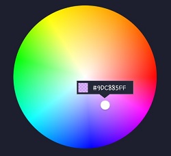
Palette
If we do not set any customized palette, the default palette drawable is the ColorHsvPalette.
We can move and select a point on the palette using a specific color using the below methods.
colorPickerView.selectByHsvColor(color);
colorPickerView.selectByHsvColorRes(R.color.colorPrimary);
We can change the default palette as a desired image drawable using the below method.
But if we change the palette using another drawable, we can not use the selectByHsvColor method.
colorPickerView.setPaletteDrawable(drawable);
If we want to change back to the default palette, we can change it using the below method.
colorPickerView.setHsvPaletteDrawable();
ActionMode
ActionMode is an option restrict to invoke the ColorListener by user actions.
colorPickerView.setActionMode(ActionMode.LAST); // ColorListener will be invoked when the finger is released.
Debounce
Only emits color values to the listener if a particular timespan has passed without it emitting using debounceDuration attribute.
We can set the debounceDuration on our xml layout file.
app:debounceDuration="150"
Or we can set it programmatically.
colorPickerView.setDebounceDuration(150);
Create using builder
This is how to create ColorPickerView's instance using ColorPickerView.Builder class.
ColorPickerView colorPickerView = new ColorPickerView.Builder(context)
      .setColorListener(colorListener)
      .setPreferenceName("MyColorPicker");
      .setActionMode(ActionMode.LAST)
      .setAlphaSlideBar(alphaSlideBar)
      .setBrightnessSlideBar(brightnessSlideBar)
      .setFlagView(new CustomFlag(context, R.layout.layout_flag))
      .setPaletteDrawable(ContextCompat.getDrawable(context, R.drawable.palette))
      .setSelectorDrawable(ContextCompat.getDrawable(context, R.drawable.selector))
      .build();
Initial color
We can set an initial color and set positions of selector and slideBars based on the initial color.
This function will work only with a default HSV palette.
If we set preference name using the setPreferenceName method, this function will work only once.
app:initialColor="@color/colorPrimary"
Or we can use this method programmatically.
.setInitialColor(color);
.setInitialColorRes(R.color.colorPrimary);
Restore and save
This is how to restore the state of ColorPickerView.
setPreferenceName() method restores all of the saved states (selector, color) automatically.
colorPickerView.setPreferenceName("MyColorPicker");
This is how to save the states of ColorPickerView.
setLifecycleOwner() method saves all of the states automatically when the lifecycleOwner is destroy.
colorPickerView.setLifecycleOwner(this);
Or we can save the states manually using the below method.
ColorPickerPreferenceManager.getInstance(this).saveColorPickerData(colorPickerView);
Manipulate and clear
We can manipulate and clear the saved states using ColorPickerPreferenceManager.
ColorPickerPreferenceManager manager = ColorPickerPreferenceManager.getInstance(this);
manager.setColor("MyColorPicker", Color.RED); // manipulates the saved color data.
manager.setSelectorPosition("MyColorPicker", new Point(120, 120)); // manipulates the saved selector's position data.
manager.clearSavedAllData(); // clears all of the states.
manager.clearSavedColor("MyColorPicker"); // clears only saved color data.
manager.restoreColorPickerData(colorPickerView); // restores the saved states manually.
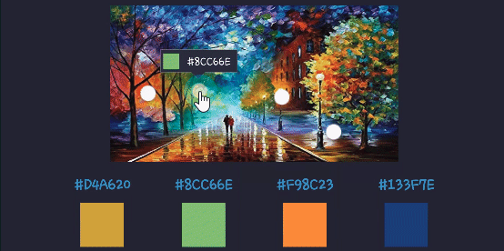
Palette from Gallery
Here is how to get a bitmap drawable from the gallery image and set it to the palette.
Declare below permission on your AndroidManifest.xml file.
<uses-permission android:name="android.permission.READ_EXTERNAL_STORAGE"/>
The below codes will start the Gallery and we can choose the desired image.
Intent photoPickerIntent = new Intent(Intent.ACTION_PICK);
photoPickerIntent.setType("image/*");
startActivityForResult(photoPickerIntent, REQUEST_CODE_GALLERY);
In the onActivityResult, we can get a bitmap drawable from the gallery and set it as the palette. And We can change the palette image of the ColorPickerView using the setPaletteDrawable method.
try {
  final Uri imageUri = data.getData();
  final InputStream imageStream = getContentResolver().openInputStream(imageUri);
  final Bitmap selectedImage = BitmapFactory.decodeStream(imageStream);
  Drawable drawable = new BitmapDrawable(getResources(), selectedImage);
  colorPickerView.setPaletteDrawable(drawable);
} catch (FileNotFoundException e) {
  e.printStackTrace();
}
AlphaSlideBar
AlphaSlideBar changes the transparency of the selected color.
AlphaSlideBar in XML layout
<com.skydoves.colorpickerview.sliders.AlphaSlideBar
   android:id="@+id/alphaSlideBar"
   android:layout_width="match_parent"
   android:layout_height="wrap_content"
   app:selector_AlphaSlideBar="@drawable/wheel" // sets a customized selector drawable.
   app:borderColor_AlphaSlideBar="@android:color/darker_gray" // sets a color of the border.
   app:borderSize_AlphaSlideBar="5"/> // sets a size of the border.
We can attach and connect the AlphaSlideBar to our ColorPickerView using attachAlphaSlider method.
AlphaSlideBar alphaSlideBar = findViewById(R.id.alphaSlideBar);
colorPickerView.attachAlphaSlider(alphaSlideBar);
We can make it vertically using the below attributes.
android:layout_width="280dp" // width must set a specific width size.
android:layout_height="wrap_content"
android:rotation="90"
BrightnessSlideBar
BrightnessSlideBar changes the brightness of the selected color.
BrightnessSlideBar in XML layout
<com.skydoves.colorpickerview.sliders.BrightnessSlideBar
   android:id="@+id/brightnessSlide"
   android:layout_width="match_parent"
   android:layout_height="wrap_content"
   app:selector_BrightnessSlider="@drawable/wheel" // sets a customized selector drawable.
   app:borderColor_BrightnessSlider="@android:color/darker_gray" // sets a color of the border.
   app:borderSize_BrightnessSlider="5"/> // sets a size of the border.
We can attach and connect the BrightnessSlideBar to our ColorPickerView using attachBrightnessSlider method.
BrightnessSlideBar brightnessSlideBar = findViewById(R.id.brightnessSlide);
colorPickerView.attachBrightnessSlider(brightnessSlideBar);
We can make it vertically using the below attributes.
android:layout_width="280dp" // width must set a specific width size.
android:layout_height="wrap_content"
android:rotation="90"
ColorPickerDialog
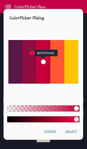
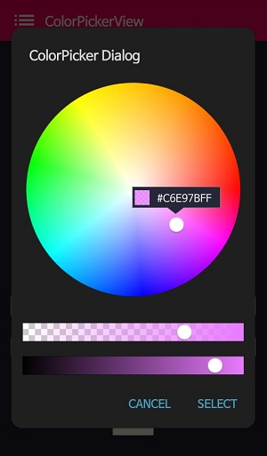
ColorPickerDialog can be used just like an AlertDialog and it provides colors by tapping from any drawable.
new ColorPickerDialog.Builder(this)
      .setTitle("ColorPicker Dialog")
      .setPreferenceName("MyColorPickerDialog")
      .setPositiveButton(getString(R.string.confirm),
          new ColorEnvelopeListener() {
              @Override
              public void onColorSelected(ColorEnvelope envelope, boolean fromUser) {
                  setLayoutColor(envelope);
              }
          })
       .setNegativeButton(getString(R.string.cancel),
          new DialogInterface.OnClickListener() {
              @Override
              public void onClick(DialogInterface dialogInterface, int i) {
                  dialogInterface.dismiss();
              }
           })
      .attachAlphaSlideBar(true) // the default value is true.
      .attachBrightnessSlideBar(true)  // the default value is true.
      .setBottomSpace(12) // set a bottom space between the last slidebar and buttons.
      .show();
we can get an instance of ColorPickerView from the ColorPickerView.Builder and we can customize it.
ColorPickerView colorPickerView = builder.getColorPickerView();
colorPickerView.setFlagView(new CustomFlag(this, R.layout.layout_flag)); // sets a custom flagView
builder.show(); // shows the dialog
FlagView
We can implement showing a FlagView above and below on the selector.
This library provides BubbleFlagView by default as we can see the previews.
Here is the example code for implementing it.
BubbleFlag bubbleFlag = new BubbleFlag(this);
bubbleFlag.setFlagMode(FlagMode.FADE);
colorPickerView.setFlagView(bubbleFlag);
We can also fully customize the FlagView like below.
First, We need a customized layout like below.
<?xml version="1.0" encoding="utf-8"?>
<LinearLayout xmlns:android="http://schemas.android.com/apk/res/android"
    xmlns:tools="http://schemas.android.com/tools"
    android:layout_width="100dp"
    android:layout_height="40dp"
    android:background="@drawable/flag"
    android:orientation="horizontal">

    <LinearLayout
        android:id="@+id/flag_color_layout"
        android:layout_width="20dp"
        android:layout_height="20dp"
        android:layout_marginTop="6dp"
        android:layout_marginLeft="5dp"
        android:orientation="vertical"/>

    <TextView
        android:id="@+id/flag_color_code"
        android:layout_width="wrap_content"
        android:layout_height="wrap_content"
        android:layout_marginTop="6dp"
        android:layout_marginLeft="10dp"
        android:layout_marginRight="5dp"
        android:textSize="14dp"
        android:textColor="@android:color/white"
        android:maxLines="1"
        android:ellipsize="end"
        android:textAppearance="?android:attr/textAppearanceSmall"
        tools:text="#ffffff"/>
</LinearLayout>
Second, we need to create a class that extends FlagView. Here is an example code.
public class CustomFlag extends FlagView {

    private TextView textView;
    private AlphaTileView alphaTileView;

    public CustomFlag(Context context, int layout) {
        super(context, layout);
        textView = findViewById(R.id.flag_color_code);
        alphaTileView = findViewById(R.id.flag_color_layout);
    }

    @Override
    public void onRefresh(ColorEnvelope colorEnvelope) {
        textView.setText("#" + colorEnvelope.getHexCode());
        alphaTileView.setPaintColor(colorEnvelope.getColor());
    }
}
And last, set the FlagView to the ColorPickerView using the setFlagView method.
colorPickerView.setFlagView(new CustomFlag(this, R.layout.layout_flag));
FlagMode
FlagMode is an option to decides the visibility action of the FlagView.
colorPickerView.setFlagMode(FlagMode.ALWAYS); // showing always by tapping and dragging.
colorPickerView.setFlagMode(FlagMode.LAST); // showing only when finger released.
AlphaTileView
AlphaTileView visualizes ARGB colors over the view.
If we need to represent ARGB colors on the general view, it will not be showing accurately. Because a color will be mixed with the parent view's background color. so if we need to represent ARGB colors accurately, we can use the AlphaTileView.
<com.skydoves.colorpickerview.AlphaTileView
     android:id="@+id/alphaTileView"
     android:layout_width="55dp"
     android:layout_height="55dp"
     app:tileSize="20" // the size of the repeating tile
     app:tileEvenColor="@color/tile_even" // the color of even tiles
     app:tileOddColor="@color/tile_odd"/> // the color of odd tiles
ColorPickerView Methods
| Methods | Return | Description |
|---|---|---|
| getColor() | int | gets the last selected color. |
| getColorEnvelope() | ColorEnvelope | gets the ColorEnvelope of the last selected color. |
| setPaletteDrawable(Drawable drawable) | void | changes palette drawable manually. |
| setSelectorDrawable(Drawable drawable) | void | changes selector drawable manually. |
| setSelectorPoint(int x, int y) | void | selects the specific coordinate of the palette manually. |
| selectByHsvColor(@ColorInt int color) | void | changes selector's selected point by a specific color. |
| selectByHsvColorRes(@ColorRes int resource) | void | changes selector's selected point by a specific color using a color resource. |
| setHsvPaletteDrawable() | void | changes the palette drawable as the default drawable (ColorHsvPalette). |
| selectCenter() | void | selects the center of the palette manually. |
| setInitialColor(@ColorInt int color) | void | changes selector's selected point by a specific color initially. |
| setInitialColorRes(@ColorRes int resource) | void | changes selector's selected point by a specific color initially using a color resource. |
| setActionMode(ActionMode) | void | sets the color listener's trigger action mode. |
| setFlagView(FlagView flagView) | void | sets FlagView on ColorPickerView. |
| attachAlphaSlider | void | linking an AlphaSlideBar on the ColorPickerView. |
| attachBrightnessSlider | void | linking an BrightnessSlideBar on the ColorPickerView. |
Other Libraries
Here are other ColorPicker related libraries!
ColorPickerPreference
A library that let you implement ColorPickerView, ColorPickerDialog, ColorPickerPreference.
Multi-ColorPickerView
You can get colors using multi selectors. At here you can get a more specialized library on multi-coloring.
Find this library useful? :heart:
Support it by joining stargazers for this repository. :star: And follow me for my next creations! 🤩
License
Copyright 2017 skydoves (Jaewoong Eum)

Licensed under the Apache License, Version 2.0 (the "License");
you may not use this file except in compliance with the License.
You may obtain a copy of the License at

   http://www.apache.org/licenses/LICENSE-2.0

Unless required by applicable law or agreed to in writing, software
distributed under the License is distributed on an "AS IS" BASIS,
WITHOUT WARRANTIES OR CONDITIONS OF ANY KIND, either express or implied.
See the License for the specific language governing permissions and
limitations under the License.
*Note that all licence references and agreements mentioned in the ColorPickerView README section above
are relevant to that project's source code only.