material-menu alternatives and similar packages
Based on the "Material Widget" category.
Alternatively, view material-menu alternatives based on common mentions on social networks and blogs.
-
-
material-dialogs
DISCONTINUED. 😍 A beautiful, fluid, and extensible dialogs API for Kotlin & Android. -
MaterialDrawer
The flexible, easy to use, all in one drawer library for your Android project. Now brand new with material 2 design. -
android-floating-action-button
Floating Action Button for Android based on Material Design specification -
Carbon
Material Design implementation for Android 4.0+. Shadows, ripples, vectors, fonts, animations, widgets, rounded corners and more. -
MaterialDialog
DISCONTINUED. An Android library for conveniently building Material Design Dialog in Android version 2.2 ~ L. -
MaterialList
An Android library aimed to get the beautiful CardViews that Google shows at its official design specifications -
MaterialNavigationDrawer
DISCONTINUED. Navigation Drawer Activity with material design style and simplified methods -
MaterialTabs
DISCONTINUED. Custom Tabs with Material Design effects. It requires 14+ API and android support v7 (Toolbar) -
snackbar
[DEPRECATED] Android Library that implements Snackbars from Google's Material Design documentation. -
MaterialEverywhere
Showcase of the new AppCompat 21, which includes new Material Theme, working in pre-21 devices. -
Material Dialogs for Android 📱
📱Android Library to implement animated, 😍beautiful, 🎨stylish Material Dialog in android apps easily. -
android-materialshadowninepatch
Provides 9-patch based drop shadow for view elements. Works on API level 9 or later. -
uberprogressview
:hourglass_flowing_sand: An android progress view developed after taking inspiration from Uber app.

WorkOS - The modern identity platform for B2B SaaS


* Code Quality Rankings and insights are calculated and provided by Lumnify.
They vary from L1 to L5 with "L5" being the highest.
Do you think we are missing an alternative of material-menu or a related project?


README
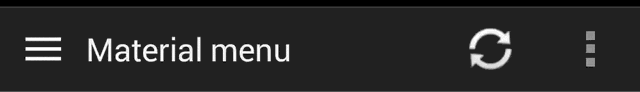
Material Menu
Morphing Android menu, back, dismiss and check buttons
Have full control of the animation:
Including in your project
compile 'com.balysv.materialmenu:material-menu:2.0.0'
Versions up to 2.0 (deprecated)
See README for setting up older versions of the library.
Usage
MaterialMenuDrawable
Use it as a standalone drawable in your Toolbar:
private MaterialMenuDrawable materialMenu;

protected void onCreate(Bundle savedInstanceState) {
    super.onCreate(savedInstanceState);
    setContentView(R.layout.toolbar);
    Toolbar toolbar = (Toolbar) findViewById(R.id.toolbar);
    setSupportActionBar(toolbar);
    toolbar.setNavigationOnClickListener(new View.OnClickListener() {
        @Override public void onClick(View v) {
        // Handle your drawable state here
        materialMenu.animateState(newState);
      }
    });
    materialMenu = new MaterialMenuDrawable(this, Color.WHITE, Stroke.THIN);
    toolbar.setNavigationIcon(materialMenu);
}
MaterialMenuView
A plain old View that draws the icon and provides an API to manipulate its state. You can embed it
in any layout including a Toolbar.
Customisation is also available through xml attributes:
app:mm_color="color"               // Color of drawable
app:mm_visible="boolean"           // Visible
app:mm_transformDuration="integer" // Transformation animation duration
app:mm_scale="integer"             // Scale factor of drawable
app:mm_strokeWidth="integer"       // Stroke width of icons (can only be 1, 2 or 3)
app:mm_rtlEnabled="boolean"        // Enabled RTL layout support (flips all drawables)
app:mm_iconState="enum"            // Set the intial state of the drawable (burger, arrow, x or check)
API
There are four icon states:
BURGER, ARROW, X, CHECK
To morph the drawable state
MaterialMenu.animateIconState(IconState state)
To change the drawable state without animation
MaterialMenu.setIconState(IconState state)
To animate the drawable manually (i.e. on navigation drawer slide):
MaterialMenu.setTransformationOffset(AnimationState state, float value)
To hide or show the drawable:
MaterialMenu.setVisible(boolean visible)
where AnimationState is one of BURGER_ARROW, BURGER_X, ARROW_X, ARROW_CHECK, BURGER_CHECK, X_CHECK
and value is between 0 and 2
Note: The icon state is resolved by current offset value. Make sure you use offset between 0 and 1 for forward animation and 1 and 2 for backwards to correctly save icon state on activity recreation.
NavigationDrawer slide interaction
Implement MaterialMenu into your ActionBar as described above and add a custom DrawerListener:
private DrawerLayout drawerLayout;
private boolean isDrawerOpened;
private MaterialMenuDrawable materialMenu;

@Override
protected void onCreate(Bundle savedInstanceState) {
    super.onCreate(savedInstanceState);
    toolbar = (Toolbar) findViewById(R.id.toolbar);
    setSupportActionBar(toolbar);
    materialMenu = new MaterialMenuDrawable(this, Color.WHITE, Stroke.THIN);
    toolbar.setNavigationIcon(materialMenu);

    drawerLayout = (DrawerLayout) findViewById(R.id.drawer_layout);
    drawerLayout.setDrawerListener(new DrawerLayout.SimpleDrawerListener() {
        @Override
        public void onDrawerSlide(View drawerView, float slideOffset) {
            materialMenu.setTransformationOffset(
                MaterialMenuDrawable.AnimationState.BURGER_ARROW,
                isDrawerOpened ? 2 - slideOffset : slideOffset
            );
        }

        @Override
        public void onDrawerOpened(View drawerView) {
            isDrawerOpened = true;
        }

        @Override
        public void onDrawerClosed(View drawerView) {
            isDrawerOpened = false;
        }

        @Override
        public void onDrawerStateChanged(int newState) {
            if(newState == DrawerLayout.STATE_IDLE) {
                if(isDrawerOpened) {
                   menu.setIconState(MaterialMenuDrawable.IconState.ARROW);
                } else {
                   menu.setIconState(MaterialMenuDrawable.IconState.BURGER);
                }
            }
        }
    });
}
Developed By
Balys Valentukevicius
License
Copyright 2016 Balys Valentukevicius

Licensed under the Apache License, Version 2.0 (the "License");
you may not use this file except in compliance with the License.
You may obtain a copy of the License at

   http://www.apache.org/licenses/LICENSE-2.0

Unless required by applicable law or agreed to in writing, software
distributed under the License is distributed on an "AS IS" BASIS,
WITHOUT WARRANTIES OR CONDITIONS OF ANY KIND, either express or implied.
See the License for the specific language governing permissions and
limitations under the License.
*Note that all licence references and agreements mentioned in the material-menu README section above
are relevant to that project's source code only.