PagerSlidingTabStrip alternatives and similar packages
Based on the "Navigation" category.
Alternatively, view PagerSlidingTabStrip alternatives based on common mentions on social networks and blogs.
-
SlidingTutorial
Android Library for making animated tutorials inside your app -
Compose Destinations
Annotation processing library for type-safe Jetpack Compose navigation with no boilerplate. -
Bubble Navigation
🎉 [Android Library] A light-weight library to easily make beautiful Navigation Bar with ton of 🎨 customization option. -
FragNav
An Android library for managing multiple stacks of fragments -
RecyclerTabLayout
An efficient TabLayout library implemented with RecyclerView. -
AnimatedBottomBar
A customizable and easy to use BottomBar navigation view with sleek animations, with support for ViewPager, ViewPager2, NavController, and badges. -
Duo Navigation Drawer
A flexible, easy to use, unique drawer library for your Android project. -
Chip Navigation Bar
An android navigation bar widget -
BubbleTabBar
BubbleTabBar is a bottom navigation bar with customizable bubble-like tabs -
Compose Navigation Reimagined
🌈 Type-safe navigation library for Jetpack Compose -
Fragula 2
🧛 Fragula is a swipe-to-dismiss extension for navigation component library for Android -
Alligator
Alligator is Android navigation library that will help to organize your navigation code in clean and testable way. -
Okuki
Okuki is a simple, hierarchical navigation bus and back stack for Android, with optional Rx bindings, and Toothpick DI integration. -
CarMarker-Animation
Marker Animation android googlemap -
Dual-color-Polyline-Animation
This library will help to show the polyline in dual color similar as Uber. -
Keyboard Dismisser
Dismiss your keyboard by tapping anywhere outside it. -
-
TypedNavigation
A lightweight library to help you navigate in compose with well typed functions. -
Facilis
A sleek, out of the box, easy to understand and use, swipe gesture based Navigational Library for android. -
fragstack
Memory efficient android library for managing individual fragment backstack. -
what3words Autosuggest EditText
An Android library to use what3words autosuggest -
AndroidBriefActions
Android library for sending and observing non persistent actions such as showing a message; nice readable way to call navigation actions from ViewModel or Activity/Fragment. -
EasySideNavigation
Create side navigation in easy way

InfluxDB - Power Real-Time Data Analytics at Scale


* Code Quality Rankings and insights are calculated and provided by Lumnify.
They vary from L1 to L5 with "L5" being the highest.
Do you think we are missing an alternative of PagerSlidingTabStrip or a related project?

|
WorkOS - The modern identity platform for B2B SaaS
sponsored
workos.com
|
Popular Comparisons
-
PagerSlidingTabStripvsDuo Navigation Drawer
-
PagerSlidingTabStripvsSlidingTutorial
-
PagerSlidingTabStripvsFragNav
-
PagerSlidingTabStripvsBubble Navigation
-
PagerSlidingTabStripvsRecyclerTabLayout

|
SaaSHub - Software Alternatives and Reviews
sponsored
www.saashub.com
|
README
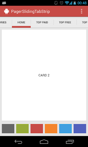
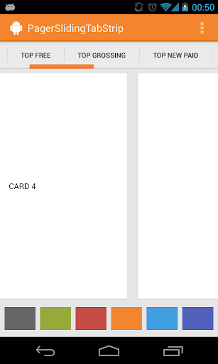
Android PagerSlidingTabStrip
Interactive paging indicator widget, compatible with the ViewPager from the
Android Support Library.
Try out the sample application on the Play Store.
Usage
For a working implementation of this project see the sample/ folder.
Include the library as local library project or add the dependency in your build.gradle.
dependencies {
    compile 'com.astuetz:pagerslidingtabstrip:1.0.1'
}
Include the PagerSlidingTabStrip widget in your layout. This should usually be placed above the
ViewPagerit represents.<com.astuetz.PagerSlidingTabStrip android:id="@+id/tabs" android:layout_width="match_parent" android:layout_height="48dip" />In your
onCreatemethod (oronCreateViewfor a fragment), bind the widget to theViewPager.// Initialize the ViewPager and set an adapter ViewPager pager = (ViewPager) findViewById(R.id.pager); pager.setAdapter(new TestAdapter(getSupportFragmentManager())); // Bind the tabs to the ViewPager PagerSlidingTabStrip tabs = (PagerSlidingTabStrip) findViewById(R.id.tabs); tabs.setViewPager(pager);(Optional) If you use an
OnPageChangeListenerwith your view pager you should set it in the widget rather than on the pager directly.// continued from above tabs.setOnPageChangeListener(mPageChangeListener);
Customization
To not just look like another Play Store styled app, go and adjust these values to match your brand:
pstsIndicatorColorColor of the sliding indicatorpstsUnderlineColorColor of the full-width line on the bottom of the viewpstsDividerColorColor of the dividers between tabspstsIndicatorHeightHeight of the sliding indicatorpstsUnderlineHeightHeight of the full-width line on the bottom of the viewpstsDividerPaddingTop and bottom padding of the dividerspstsTabPaddingLeftRightLeft and right padding of each tabpstsScrollOffsetScroll offset of the selected tabpstsTabBackgroundBackground drawable of each tab, should be a StateListDrawablepstsShouldExpandIf set to true, each tab is given the same weight, default falsepstsTextAllCapsIf true, all tab titles will be upper case, default true
All attributes have their respective getters and setters to change them at runtime
Changelog
Current Version: 1.0.1
1.0.1
- Upgraded gradle build files
- Changed package name to
com.astuetz.PagerSlidingTabStrip - #37, #41 Added
pstsprefix to all attributes inattrs.xml - #46 Changed the shouldExpand behavior to set the layout at the time the tab is added
Developed By
- Andreas Stuetz - [email protected]
Credits
- Kirill Grouchnikov - Author of an explanation post on Google+
License
Copyright 2013 Andreas Stuetz

Licensed under the Apache License, Version 2.0 (the "License");
you may not use this file except in compliance with the License.
You may obtain a copy of the License at

   http://www.apache.org/licenses/LICENSE-2.0

Unless required by applicable law or agreed to in writing, software
distributed under the License is distributed on an "AS IS" BASIS,
WITHOUT WARRANTIES OR CONDITIONS OF ANY KIND, either express or implied.
See the License for the specific language governing permissions and
limitations under the License.
*Note that all licence references and agreements mentioned in the PagerSlidingTabStrip README section above
are relevant to that project's source code only.