Description
Sliding Tab Layout With Color Icons!
Sliding Tab With Color Icons alternatives and similar packages
Based on the "ViewPager Widget" category.
Alternatively, view Sliding Tab With Color Icons alternatives based on common mentions on social networks and blogs.
-
Android-ViewPagerIndicator
DISCONTINUED. Paging indicator widgets compatible with the ViewPager from the Android Support Library and ActionBarSherlock. Originally based on Patrik Åkerfeldt's ViewFlow. -
SCViewPager
A simple keyframe-based animation framework for UIKit. Perfect for scrolling app intros. -
WoWoViewPager
Combine ViewPager and Animations to provide a simple way to create applications' guide pages. -
MultiViewPager
The MultiViewPager is an extension of the support-v4 library's ViewPager that allows the pages to be wider or narrower than the ViewPager itself. It takes care of aligning the pages next to each other, and always keeping the selected page centered. -
-
parallaxviewpager
DISCONTINUED. [Development stopped in 2014. Unfinished and not stable - not recommended to use.] An easy-to-use ViewPager subclass with parallax background effect for Android apps. -
-
NumericPageIndicator
Android - A ViewPager page indicator that displays the current page number and (optionally) the page count -
ViewPagerExtensions
DISCONTINUED. A set of custom views for the ViewPager from the Android Support Package -
Android-ScreenSlidePager
DISCONTINUED. Pager (especially for ViewPager) indicator in two styles: circle & fraction. -
LastPagerAdapter
Don't write a ViewPager Adapter! Hook up your ViewPager to your data model using Android Data Binding Framework. With Kotlin support!

InfluxDB - Power Real-Time Data Analytics at Scale


* Code Quality Rankings and insights are calculated and provided by Lumnify.
They vary from L1 to L5 with "L5" being the highest.
Do you think we are missing an alternative of Sliding Tab With Color Icons or a related project?


README
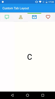
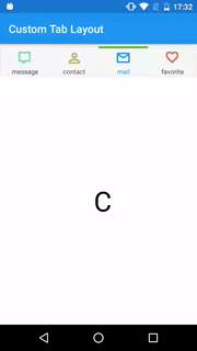
Sliding Tab With Color Icons
Sliding Tab With Color Icons!
Kindly use the following links to use this library:
In build.gradle (Project)
allprojects {
    repositories {
    ...
        maven { url "https://jitpack.io" }
    }
}
And then in the other gradle file(may be your app gradle or your own module library gradle, but never add in both of them to avoid conflict.)
 dependencies {
    compile 'com.github.myinnos:SlidingTabWithColorIcons:1.0'
    }
How to use
Step 1: create layout:
<?xml version="1.0" encoding="utf-8"?>
<RelativeLayout xmlns:android="http://schemas.android.com/apk/res/android"
    xmlns:tab="http://schemas.android.com/apk/res-auto"
    android:layout_width="match_parent"
    android:layout_height="match_parent">

    <in.myinnos.customimagetablayout.ChangeColorTab
        android:id="@+id/tabChangeColorTab"
        android:layout_width="match_parent"
        android:layout_height="60dp">

        <in.myinnos.customimagetablayout.ChangeColorItem
            android:layout_width="0dp"
            android:layout_height="fill_parent"
            android:layout_weight="1"
            android:padding="5dp"
            tab:item_icon="@drawable/ic_one"
            tab:item_icon_color="#ff45c01a"
            tab:item_tab_color="@color/colorPrimary"
            tab:item_tab_position="bottom"
            tab:item_text="message"
            tab:item_text_color="@color/colorPrimaryDark"
            tab:item_text_size="12sp" />

        ...

    </in.myinnos.customimagetablayout.ChangeColorTab>

    <android.support.v4.view.ViewPager
        android:id="@+id/viewpager"
        android:layout_width="match_parent"
        android:layout_height="match_parent"
        android:layout_below="@+id/tabChangeColorTab" />
</RelativeLayout>
Step 2: set view pager to ChangeColorTab:
ViewPager mViewPager = (ViewPager) findViewById(R.id.viewpager);
ChangeColorTab changeColorTab = (ChangeColorTab) findViewById(R.id.tabChangeColorTab);
changeColorTab.setViewpager(mViewPager);
//Attach page Adapter
mViewPager.setAdapter(<YOUR_VIEW_PAGE_ADAPTER>);
Features
- Set Tab Icon:
xml tab:item_icon="@drawable/ic_one" - Change Icon Color:
xml tab:item_icon_color="#ff45c01a" - Change Tab Color:
xml tab:item_tab_color="@color/colorPrimary" - Change Tab Line Position (bottom|top):
xml tab:item_tab_position="bottom" - Set Text (no need text simply skip this):
xml tab:item_text="message" - Change Text Color:
xml tab:item_text_color="@color/colorPrimaryDark" - Change Text Size:
xml
tab:item_text_size="12sp"
Any Queries? or Feedback, please let me know by opening a new issue!
Contact
Prabhakar Thota
- :globe_with_meridians: Website: myinnos.in
- :email: e-mail: [email protected]
- :mag_right: LinkedIn: PrabhakarThota
- :thumbsup: Twitter: @myinnos
License
Copyright 2017 MyInnos

Licensed under the Apache License, Version 2.0 (the "License");
you may not use this file except in compliance with the License.
You may obtain a copy of the License at

   http://www.apache.org/licenses/LICENSE-2.0

Unless required by applicable law or agreed to in writing, software
distributed under the License is distributed on an "AS IS" BASIS,
WITHOUT WARRANTIES OR CONDITIONS OF ANY KIND, either express or implied.
See the License for the specific language governing permissions and
limitations under the License.
*Note that all licence references and agreements mentioned in the Sliding Tab With Color Icons README section above
are relevant to that project's source code only.