
android-segmented-control alternatives and similar packages
Based on the "Other Widget" category.
Alternatively, view android-segmented-control alternatives based on common mentions on social networks and blogs.
-
AndroidSlidingUpPanel
This library provides a simple way to add a draggable sliding up panel (popularized by Google Music and Google Maps) to your Android application. Brought to you by Umano. -
-
BottomBar
(Deprecated) A custom view component that mimics the new Material Design Bottom Navigation pattern. -
ShortcutBadger
An Android library supports badge notification like iOS in Samsung, LG, Sony and HTC launchers. -
-
SystemBarTint
[DEPRECATED] Apply background tinting to the Android system UI when using KitKat translucent modes -
TapTargetView
An implementation of tap targets from the Material Design guidelines for feature discovery. -
android-viewbadger
[DEPRECATED] A simple way to "badge" any given Android view at runtime without having to cater for it in layout -
android-stackblur
Android StackBlur is a library that can perform a blurry effect on a Bitmap based on a gradient or radius, and return the result. The library is based on the code of Mario Klingemann. -
android-iconify
Android integration of multiple icon providers such as FontAwesome, Entypo, Typicons,... -
DraggablePanel
DISCONTINUED. Android library used to create an awesome Android UI based on a draggable element similar to the last YouTube graphic component. -
aFileChooser
DISCONTINUED. [DEPRECATED] Android library that provides a file explorer to let users select files on external storage. -
Swipecards
A Tinder-like Android library to create the swipe cards effect. You can swipe left or right to like or dislike the content. -
-
-
TourGuide
TourGuide is an Android library that aims to provide an easy way to add pointers with animations over a desired Android View -
StickyGridHeaders
DISCONTINUED. An Android Library that makes it easy to make grid views with sectioned data and headers that stick to the top. -
FloatingView
FloatingView can make the target view floating above the anchor view with cool animation -
-
TileView
TileView is a subclass of android.view.ViewGroup that asynchronously displays, pans and zooms tile-based images. Plugins are available for features like markers, hotspots, and path drawing. -
Bubbles for Android
Bubbles for Android is an Android library to provide chat heads capabilities on your apps. With a fast way to integrate with your development. -
RippleView
View that imitates Ripple Effect on click which was introduced in Android L (for Android 2.3+) -
Android-ActionItemBadge
This library offers a simple method to add a small badge icon to your ActionBar-MenuItem -
android-sliding-layer-lib
DISCONTINUED. Highly customizable SlidingLayer as you have seen in Wunderlist -
SortableTableView
An Android library containing a simple TableView and an advanced SortableTableView providing a lot of customisation possibilities to fit all needs. -
ScratchView
ScratchView repo is UX Design involving scratch cards like views which are scratched to reveal the information they conceal. -
android-FlipView
A small, easy to use android library for implementing flipping between views as seen in the popular Flipboard application


WorkOS - The modern identity platform for B2B SaaS


* Code Quality Rankings and insights are calculated and provided by Lumnify.
They vary from L1 to L5 with "L5" being the highest.
Do you think we are missing an alternative of android-segmented-control or a related project?


README
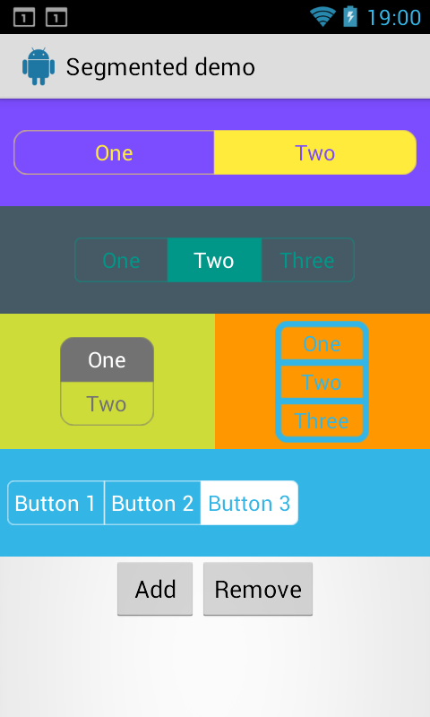
android-segmented-control
Android-Segmented is a custom view for Android which is based on RadioGroup and RadioButton widget. This implementation is inspired by Segmented Controls for iOS.
Including in your project:
Download source code and import as module
The latest code has bug fixes, iOS 7's (and up) style segment control (which has nice fade animation and tint) and support for Font Awesome. (These features has not been pushed to Maven yet)
Using maven
Android-Segmented Library is pushed to Maven Central, so you just need to add the following dependency to your build.gradle.
dependencies {
    compile 'info.hoang8f:android-segmented:1.0.6'
}
Manually
Copy(or merge) below files into corresponding file/folder:
- SegmentedGroup.java
- res/drawable/*
- res/drawable-v14/*
- res/values/colors.xml
- res/values/dimens.xml
- res/values/styles.xml (only RadioButton style)
Usage
Define in xml like this and make sure that the RadioButton's style is: @style/RadioButton
<attr name="sc_corner_radius" format="dimension" />
<attr name="sc_border_width" format="dimension" />
<attr name="sc_tint_color" format="color" />
<attr name="sc_checked_text_color" format="color" />
Sample code:
<info.hoang8f.android.segmented.SegmentedGroup
    xmlns:segmentedgroup="http://schemas.android.com/apk/res-auto"
    android:id="@+id/segmented2"
    android:layout_width="wrap_content"
    android:layout_height="wrap_content"
    android:layout_margin="10dp"
    android:orientation="horizontal"
    segmentedgroup:sc_border_width="2dp"
    segmentedgroup:sc_corner_radius="10dp">

    <RadioButton
        android:id="@+id/button21"
        android:layout_width="wrap_content"
        android:layout_height="wrap_content"
        android:text="One"
        style="@style/RadioButton" />

    <RadioButton
        android:id="@+id/button22"
        android:layout_width="wrap_content"
        android:layout_height="wrap_content"
        android:text="Two"
        style="@style/RadioButton" />
</info.hoang8f.android.segmented.SegmentedGroup>
You also can be change the tint color and title color when button is checked by setTintColor method.
Here is sample code:
SegmentedGroup segmented2 = (SegmentedGroup) rootView.findViewById(R.id.segmented2);
segmented2.setTintColor(Color.DKGRAY);

SegmentedGroup segmented3 = (SegmentedGroup) rootView.findViewById(R.id.segmented3);
segmented3.setTintColor(Color.parseColor("#FFD0FF3C"), Color.parseColor("#FF7B07B2"));

SegmentedGroup segmented4 = (SegmentedGroup) rootView.findViewById(R.id.segmented4);
segmented4.setTintColor(getResources().getColor(R.color.radio_button_selected_color));
If you dont specify border_width and/or corner_radius the default values will be used (1dp for border_width and 5 dp for corner_radius)
Credits
Author:
- Le Van Hoang (@hoang8f)
- Added support for vertical RadioGroup by tchar.
License
The MIT License (MIT)

Copyright (c) 2014 Le Van Hoang

Permission is hereby granted, free of charge, to any person obtaining a copy
of this software and associated documentation files (the "Software"), to deal
in the Software without restriction, including without limitation the rights
to use, copy, modify, merge, publish, distribute, sublicense, and/or sell
copies of the Software, and to permit persons to whom the Software is
furnished to do so, subject to the following conditions:

The above copyright notice and this permission notice shall be included in all
copies or substantial portions of the Software.

THE SOFTWARE IS PROVIDED "AS IS", WITHOUT WARRANTY OF ANY KIND, EXPRESS OR
IMPLIED, INCLUDING BUT NOT LIMITED TO THE WARRANTIES OF MERCHANTABILITY,
FITNESS FOR A PARTICULAR PURPOSE AND NONINFRINGEMENT. IN NO EVENT SHALL THE
AUTHORS OR COPYRIGHT HOLDERS BE LIABLE FOR ANY CLAIM, DAMAGES OR OTHER
LIABILITY, WHETHER IN AN ACTION OF CONTRACT, TORT OR OTHERWISE, ARISING FROM,
OUT OF OR IN CONNECTION WITH THE SOFTWARE OR THE USE OR OTHER DEALINGS IN THE
SOFTWARE.
*Note that all licence references and agreements mentioned in the android-segmented-control README section above
are relevant to that project's source code only.